|
|
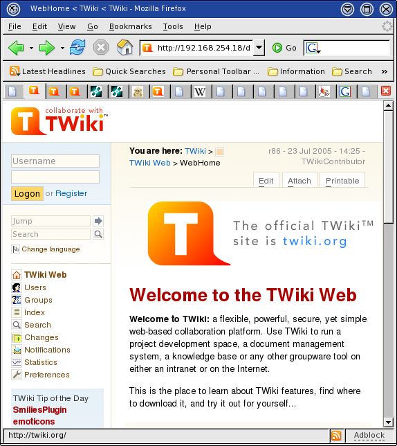
Real World: The users ask "How do I login?" I tell them to look at the top of the left menu bar. "Oh!"
Its just as easy to have the login form there as the link to a page with a login form.
Access violations still take the user to a login screen. A popup would be nicer.
See screennshot
Although your approach to make the login facility more visible serves it not being overseen but is contraproductive in terms of GUI simplicity aka information overflow. What if I already know how to login and I don't want to see the form again and again? Banner blindness follows.
If you're willing to use javascript you can have your cake and eat it too: the logon text is a link, but when you click it instead of taking you to a new page it expands the logon form. Drawback: the form would be sent with every page, adding to overall page bloat.
If you're designing for an Intranet/extranet it makes sense to put the login prominent. For public websites I find it too distracting to put the login fields on each page. The js (toggle) idea is neat but as said adds to the page - of not logged in viewers only. Part of the neatness of the login on the page is lost because the page should be anyway after logging in (perhaps buttons are enabled then or made visible). I don't see a bug in here (perhaps a cookbook entry) so I suggest to move discussions to Codev. AC Undeferred, post Dakar CC
Although your approach to make the login facility more visible serves it not being overseen but is contraproductive in terms of GUI simplicity aka information overflow. What if I already know how to login and I don't want to see the form again and again? Banner blindness follows.
- What if the site is resticted and you must login to visit anything but the home page?
Hence you don't see it again and again. - The 'old' arrangment has the link go away and the 'personal' appear. Same here. You don't see it on every page. -- AJA
- This approach seems to elminate 'how do I log in' questions form users who are used to seeing the log-in form "up front" at othersites. Why they don't notice the "Login or Register" as links rather than exhortations I can't tell you. -- AJA
If you're willing to use javascript you can have your cake and eat it too: the logon text is a link, but when you click it instead of taking you to a new page it expands the logon form. Drawback: the form would be sent with every page, adding to overall page bloat.
If you're designing for an Intranet/extranet it makes sense to put the login prominent. For public websites I find it too distracting to put the login fields on each page. The js (toggle) idea is neat but as said adds to the page - of not logged in viewers only. Part of the neatness of the login on the page is lost because the page should be anyway after logging in (perhaps buttons are enabled then or made visible). I don't see a bug in here (perhaps a cookbook entry) so I suggest to move discussions to Codev. AC Undeferred, post Dakar CC
ItemTemplate edit
| Summary | Usability - users should not have to go to another screen to login |
| ReportedBy | AJA |
| SVN Range | |
| AppliesTo | Engine |
| Component | |
| Priority | Enhancement |
| CurrentState | New |
| WaitingFor | |
| TargetRelease | major |


| I | Attachment | Action | Size | Date | Who | Comment |
|---|---|---|---|---|---|---|
| |
ISW11.png | manage | 105 K | 20 Oct 2005 - 10:50 | UnknownUser | Illustration of working code to put login for in left menu bar |
Edit | Attach | Print version | History: r7 < r6 < r5 < r4 | Backlinks | View wiki text | Edit wiki text | More topic actions
Topic revision: r7 - 13 Feb 2006, CrawfordCurrie
The copyright of the content on this website is held by the contributing authors, except where stated elsewhere. See Copyright Statement.  Legal Imprint Privacy Policy
Legal Imprint Privacy Policy